Just in time for Christmas, I finished migrating brandonmoeller.com from 1and1’s webservers to Host Gator, a Houston-based web hosting company that was running a great deal on all of its hosting plans for Black Friday last month. (I’ve hinted before at some of my frustration with 1and1.)
I jumped on that, saving an estimated 60 percent of web hosting costs over the next two years.
It’s a move I’ve been meaning to make for a long time, as I’ve steadily grown more frustrated with 1and1’s occasional but not frequent downtime and the resources my shared web hosting plan provided. I’ve been with 1and1 since 2004, I believe, when I signed on to a bargain of a deal of the first year or two being free. That’s back when they were entering the web hosting market here in the states.
I don’t have a lot of bad things to say about 1and1, but I was eager to leave for a plan that uses cPanel (another Houston-based company) and that will allow me to more adequately scale my web resources as I need to.
Of course, after purchasing, I discovered that there are plenty of discussions out there about Host Gator’s performance, the reputation of its new owners who are buying out a lot of the key players in the market, and its emphasis on dirt-cheap shared web hosting and loud marketing efforts.
But a bargain is a bargain. I’ve come to love a good bargain.
And the exercise of moving enables me to keep my site in shape so I can move next time there’s a good bargain and I’m out there looking. We’ll see how this goes.
And honestly, folks — so far, so good. HostGator has been a reliable solution that hasn’t failed me or frustrated me yet. I’ll keep you posted. This post and this site is not for sale.
Migrating My WordPress Multisite Network to HostGator
While transitioning this site from 1and1 to HostGator, I found that exporting the MySQL database and importing it at the new host’s phpMyAdmin didn’t work for me. I did this with a manual install of WordPress’ core files and changing my .htaccess and wp-config files to reflect the newly imported database, and in the process, reading this page on WordPress.org over and over again a thousand times.
I even pored over HostGator’s support docs, including this page specific to WordPress MU.
So, I started over and used the WordPress’ admin panel’s export function and added the import plugin to a brand-new install of WordPress that was installed using Fantastico, a script one-click-or-so library that allows HostGator (and other web host users) to quickly install an optimized version of WordPress on their web host’s server. This worked much better, but as such, all of my photos are no longer in the Media Library.
No database, No Media Library
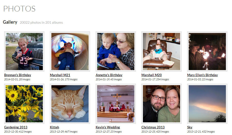
Which meant that any posts that contained a photo gallery created by the media library had to be rebuilt from my computer’s hard drive archive, as the media library no longer recognizes all the photos and the unique IDs they were given when originally installed in the previous database. Lucky for me, I only had to do this three times, as I don’t typically use WordPress’ built in photo gallery feature, instead, opting to use Picasa Web Albums (Google+ Photos) instead. I have a lot of photos. Way back when, I wanted to pick a photo solution that was future-proof, though — heh — I doubt one exists.
They are still all on my site because I was careful to ensure the paths to them didn’t change as I uploaded all of my images and other wp-content goodies via FTP.
In retrospect, I think this was a good decision because it allowed me to start my database, essentially, anew as well as WordPress’ core files as well.
WordPress is great because its team of expert developers at Automattic pride themselves on backward compatibility. However, after time, a WordPress blog that has been around forever seems to be weighed down by past artifacts that are no longer needed, or at least that’s my inclination.
New multisite upload file structure
Another stumbling block I came across was content found on my network subsite.
For my Hire Me site, which is its own WordPress “site” as part of my multisite installation, the way assets are filed in the directory structure changed with one of the more recent versions of WordPress. Since my old multisite network on my old server was installed before this change, WordPress’ backward compatibility features kept everything in the old file structure — and it just worked.
But migrating to a new installation that didn’t know that, my images on my portfolio page were no longer working when I created a new site in my new multisite network, and imported it in.
Using wordpress.org as a resource, I was quickly* able to discover what happened (a change in the Uploaded File Path), change the structure of my images, and then go in and alter every IMG tag to reflect the new file structure, then it worked.
But I was really glad I didn’t have to do this on thousands of pages on multitudes of sites within the network. Then, I’d likely have to use a database search and replace tool like Database Search and Replace Script in PHP from interconnect/it. I did use this tool on my 1and1 server to change the domain name and site URL to another one so I could compare the old version with the new, once my domain name had propagated.
* Once I discovered the problem wasn’t about my DNS settings of my domain propagating to Hostgator’s nameservers, an incredibly slow process thanks to 1and1 and their inability to offer tools like setting TLD to speed it up, alas – another story.
Conclusion
Moving is never easy. It requires attention to detail, and backups, backups, backups. Make sure you back up your database via phpMyAdmin first, then export your WordPress blog’s XML file via Tools -> Export second, then make a back up of every thing in your wp-content folder before you even begin shopping for a new web host.
Then, when you finally make a decision and purchase a new space, then make another back up.
You can’t have too many backups.
Once you have a new web hosting provider, and you’ve changed the nameservers of your domain name and added your domain name as an add-on domain [This is how cPanel does it; make sure when you’re finished you fix its need to create subdomains off your main domain by redirecting the subdomains (for example: brandonmoeller.mymaindomain.com) to the proper domain, but this is another issue], then and only then try importing your MySQL database. Maybe it will work for you. It should — I really can’t explain why it didn’t work for me, especially considering I was keeping the same domain name and everything.
But since it didn’t work, I think it allows me to keep my database more slim and trim because my previous entries in the Media Library no longer exist.
One of the immediate benefits I’ve found with my new web hosting home at HostGator is that I can now upload larger images into my media gallery, previously, I was capped at a very laughable 1 MB (though, it did force me to watch my page weight).
What’s next for BrandonMoeller.com?
As we approach a new year on a new host, I think now is as good a place as any to detail some plans for this site in the coming year.
- New Twenty Fourteen child theme for the new default theme that ships with WordPress — And this time, I hope to share it with the community by uploading it to wordpress.org’s theme repository. Get a sneak peek at it as I develop it.
- More long form articles like this one aimed at sharing what I have learned about WordPress and web development in general during my time hacking away at sites for fun and profit since 1997.
- More links to other articles that have helped me learn.
- More, more, more (Don’t want to commit to all the crazy ideas I have right now.)
 Also, I have created more than 700 posts on this WordPress-powered website. Not bad for a site I started a little more than six years ago. (Previously, I had a static HTML-powered website for about eleven years).