Post Twenty Twelve

I’ve been hacking on the new Twenty Twelve default theme for WordPress since before it was released.

The great thing about WordPress is that as soon as the open source community begins working together to tackle a problem – they begin releasing the code publicly for beta review and to allow people to begin testing or forking it. I started looking at it in June because I was intriqued by its new simplistic approach to a responsive menu.

On Sept. 27, 2012 – the new Twenty Twelve theme was officially released. As soon as it was, I knew I would want to base my BrandonMoeller.com redesign on it, as I previously did with the Twenty Eleven theme.

Here’s some screenshots of my website with the Twenty Twelve child theme I designed:

ikea-post
The standard post page
The photos page.
The photos page.
The contact page.
The contact page.

Here are some details about the new Twenty Twelve child theme.

Fonts

I’m still using the Franklin Gothic FS family of fonts that I bought from FontSpring.com two and a half years ago.

Franklin Gothic FS Medium Condensed continues to be the web font for the Site Title “Brandon Moeller” up top in the header, while I’ve chosen the Google Web Font Oswald. Right now, I’m using it for my post titles.

Here’s an article that explains the method I used to alter my functions.php file in the child theme to add Google Fonts to my website.

The new Hire page

I completely re-thought the Hire Me section of the website.

I renamed the page “Portfolio.”

I moved it to its own WordPress site within my Multi-Site installation.

It stayed at the same URL: https://brandonmoeller.com/hire/

It mirrors the look of BrandonMoeller.com except it has a unique menu and the title of the WordPress website is “Brandon” (not “Brandon Moeller”). It shares the same theme — but with one difference.

In the BrandonMoeller.com website, I have to edit the CSS via JetPack (thanks, version 1.7 ) to hide the .site-title-secondary class I created to display “Moeller” on the Hire site. (( .site-title-secondary { display: none; } ))

The Hire site’s portfolio page is a new design that incorporated the Toggle function of the Jquery library as well as shortcodes and styles I added to the child theme and the visual editor via
TinyMCE.

All that being said …

I won’t go into what I did to customize my child theme to personalize Twenty Twelve in this post. Honestly, I never found the time to finish and I’m looking forward to WordPress 3.6 and the new Twenty Thirteen theme which is expected to improve the post format UI.

Even though I am releasing this child theme to download; I’m not completely satisfied. It does look nice the way it is now and I won’t be making any more changes to it.

I think I’m looking forward to the new version of WordPress, expected in April, which will contain the new Twenty Thirteen theme.

Life is keeping me pretty busy right now. Which is a very good thing.

A new way to embed Picasa Web Albums into WordPress

Friends, I have found a new way to embed my Picasa Web Albums into WordPress.

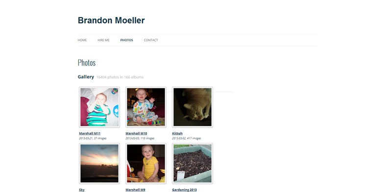
You know, the web albums that I’ve meticulously built to include 12,597 photos in 148 albums from Dec. 25, 2006 through today (as of this writing). The completist’s goal, of course, is to eventually digitize every image I come across and store it online for everyone to see in one place.

The new method comes thanks to smccandl, who created and unleashed the PWA+PHP solution on Google Code and even created a WordPress plugin that I’m now using on this website.

Here’s a little taste of what it can do.

Photos from New Year’s Day 2012

[pwaplusphp album=”NewYearSDay2012″  image_size=”800″ thumbnail_size=”135″]

See? I just embedded a small 7-photo photo album from PicasaWeb into my blog post.

By inserting a tiny shortcode that looks like this:

pwaplusphp album="NewYearSDay2012" image_size="800" thumbnail_size="165"]

So, I’ve added the plugin PWA+PHP, configured it to my liking using the easy-to-use settings page, and hope to build upon it and stylize it more in the near future.

I also had to add the FancyBox plugin to my WordPress install, so that clicking on the photos in an album would make the image jump up and display in the FancyBox jQuery style.

Of course, there was a problem with some of the FancyBox CSS rules built into the plugin; they didn’t work well with my TwentyEleven child theme, so I had to adjust some z-indexes to ensure the pop-up image would be above the navigation bar and header image.

I will make a backup of my changes and upload it in the plugin’s folder so that when I upgrade it; those changes won’t be lost … forever.

Nothing’s ever easy.

See the new Photos page in action here:

https://brandonmoeller.com/photo/

This method replaced the previous non-WordPress-native method that utilized a javascript written by Jesse Berman and previously mentioned here back in July 2010.

However, I still like that method. So I’ll keep it online, too, in the same place, here:

https://brandonmoeller.com/photos/

Here are some reasons I favor the new method:

  • I can add albums to posts and pages with shortcodes in a native WordPress environment
  • It is responsive, unlike the previous method — it looks great on a cell phone
  • Easier to customize. I hope.
  • URLs to the web albums contain the name of the album, albeit via a ? argument
  • The random photo page, powered by PWA+PHP
  • There’s even a pro version for $10, if I want to take it to the next level and include comments and a full cache.

Why this almost didn’t matter…

I’ve been pretty frustrated with Google and its PicasaWeb products this week. I believe it was back in 2009 when I chose Google over Flickr for my online photo storage solution and I did so for some important reasons. Google’s reputation was stellar back then, I thought Yahoo would bite the dust any day then (still do), and Google was preaching to the choir about great concepts like net neutrality and openness and being able to take your data with you when you got tired of their services.

So I began to upload a lot of images there. Soon thereafter, I paid a very affordable fee ($5 a year) for extra storage (up to 20 GB) for my photos. About a year later, I found Jesse Berman’s work tapping into the Google Picasa Web Album API so that I could display the images — from Google’s quick servers — on my website as if it came from there.

But in the last year or so, things have started to change. Google introduced Google+ and although it is so much cooler than Facebook and is more powerful; no one cares because EVERYONE is already on Facebook, and seriously, who wants to spend time learning new tricks on a social network that no one is using …

Slowly but surely, in an effort to get more people to use Google+ (it’s still not working), the giant company has been rolling it into every product it offers. YouTube. Google search. Gmail. And even Picasa.

But what really made me mad this week was when I realized that after agreeing to link Google+ with my Picasa software, what I was really doing was making it really hard for my family to find my photos on Picasa Web Albums, because now, they redirect automatically — and really without my knowledgeable consent and approval — to Google+. (Sure, I had to agree to it, but I honestly had no idea what it would do until it was done.)

That is, unless I add a ? argument to the end of my links.

As in:

http://picasaweb.google.com/moellerbrandon

now takes you here:

https://plus.google.com/u/0/photos/107385980338443788461/albums

Unless I alter the original link to:

http://picasaweb.google.com/moellerbrandon?noredirect=1

Apparently these changes took effect late last year, but I only found out about it while trying to show my mother how, ahem, easy it is to print photos from Picasa Web Albums, and then, I couldn’t even get there.

Thanks Google for making me look like an idiot in front of my mother, who only wants to print photos of her new grandson.

And with the launch of their new Google Drive storage solution, Google has raised its prices for storage. Luckily, I’m grandfathered in at $5/year for 20 GB but if I wanted to jump up to 25 GB I’d pay $2.49/month or $4.99/month for 100 GB. Still cheap, though, just a lot more than I pay now. Of course, I could just upload photos at 2048 pixels for the longest side; those don’t count against my storage quota.

Which makes about as much sense as all the other decisions Google has made recently.

Texas Sentinels Foundation website launches

I’m proud to announce today’s launch of the Texas Sentinels Foundation website. The website was designed by Brian Miller and developed by Brandon Moeller, and the project was managed by Brian Miller. Content was migrated from the previous HTML/CSS version to WordPress by Casey Kruse and Brandon Moeller.


Texas Sentinels Foundation

The WordPress-powered website is created with a child theme that I based on the Backstreet theme by Ridwanreedwan.

The Contribute button.

I was sure to code into the post template a Contribute button so that web visitors can support Wounded Warriors at the bottom of every story.

[clear]

It is also my responsibility to write many of the stories that appear on the website.

RSS Responsive Caption

The problem:

Readers who use Google Reader to read WordPress powered website RSS feeds on their small-screen mobile devices don’t get the full picture if the WordPress site in question uses the caption short code functionality, because the resulting inline CSS code that displays does not instruct the feed reader to scale the image down to fit the screen.

See, i.e.:

In this image, a giant photo in a post is poorly displayed in Google Reader as a result of the default settings of WordPress 3.3 (and previous versions that include the Caption feature). As displayed on my Android-powered Nexus S from Google, running the latest version of Google Reader, Version 1.1.1.

The solution:

I created a new WordPress plugin called RSS Responsive Caption to adjust the inline CSS styles that get attached to images with captions to make them more “responsive.”

Really, all that was needed was the following CSS code to specify that the maximum width of an image should be 100% (of the screen size). That’s responsive web design, in a nutshell.

max-width: 100% !important;
height: auto;

Creating a plugin to accomplish this was not necessary. In fact, anyone can do this without downloading the plugin, simply (heh) by altering lines 745-746 in the wp-includes/media.php file, from:

return ‘<div ‘ . $id . ‘class=”wp-caption ‘ . esc_attr($align) . ‘” style=”width: ‘ . (10 + (int) $width) . ‘px”>’
. do_shortcode( $content ) . ‘<p>’ . $caption . ‘</p></div>’;

to:

return ‘<div ‘ . $id . ‘class=”wp-caption ‘ . esc_attr($align) . ‘” style=”max-width: 100% !important; height: auto; width: ‘ . (10 + (int) $width) . ‘px”>’
. do_shortcode( $content ) . ‘<p>’ . $caption . ‘</p></div>’;

But! If I did it that way, then every time WordPress would release a new version of its frickin-awesome open source software package, I would have to manually go into the media.php file and change that line of code to keep my RSS feeds displaying properly in Google Reader.

Instead, I prefer the instant update method of installing the latest version of WordPress. I click the button, it does its thing and in a few moments of anticipatory suspense, I have the latest version of WordPress in all its glory, and I can troubleshoot it because my own specific modifications are separate.

That’s also why I typically choose to create child themes on top of existing themes – if the theme is ever updated by the theme author, I won’t have to manually sort out what was changed vs. how I reconfigured it, unless the theme author specifically chose to alter something I wanted to alter.

The plugin makes the viewing experience in Google Reader much better.

See, i.e.:

The photo as displayed in the RSS feed when the plugin is activated.

Download my first-ever WordPress plugin here:

RSS Responsive Caption
http://wordpress.org/extend/plugins/rss-responsive-caption

Credit:

This plugin would not have been possible if the WordPress core team didn’t create a way to “allow a plugin to replace the content that would otherwise be returned” via the caption shortcode function (see: wp-includes/media.php, line 711), or, if they didn’t further explain the add_filter function in the codex, even going so far as suggesting the following plugin:

add_filter('img_caption_shortcode', 'my_img_caption_shortcode_filter',10,3);

/**
 * Filter to replace the  shortcode text with HTML5 compliant code
 *
 * @return text HTML content describing embedded figure
 **/
function my_img_caption_shortcode_filter($val, $attr, $content = null)
{
	extract(shortcode_atts(array(
		'id'	=> '',
		'align'	=> '',
		'width'	=> '',
		'caption' => ''
	), $attr));

	if ( 1 > (int) $width || empty($caption) )
		return $val;

	$capid = '';
	if ( $id ) {
		$id = esc_attr($id);
		$capid = 'id="figcaption_'. $id . '" ';
		$id = 'id="' . $id . '" aria-labelledby="figcaption_' . $id . '" ';
	}

	return '<figure ' . $id . 'class="wp-caption ' . esc_attr($align) . '" style="width: '
	. (10 + (int) $width) . 'px">' . do_shortcode( $content ) . '<figcaption ' . $capid
	. 'class="wp-caption-text">' . $caption . '</figcaption></figure>';
}

Basically, I took the plugin above and altered it to fit my needs, after an exhaustive search to determine that someone else hadn’t already done what I wanted to do.

I got the idea for this plugin by looking at the HTML source code of the posts WordPress generates for images with captions and images without, then Googling until I discovered what made what worked.

Articles and forum posts that I came across in the exploratory process include, but are likely not limited to:

Want to further alter the way captions are handled in WordPress? This plugin looks very interesting:

About RSS Responsive Caption
from the documentation section of the plugin:

This plugin allows publishers to better control the width of photos that use the WordPress caption shortcode feature, when that content is displayed in RSS feed readers like Google Reader, as displayed on small-screen mobile devices.

This plugin accomplishes the same thing that adjusting the “function img_caption_shortcode” code in includes/media.php would, but allows the user to automatically update WordPress without worrying about losing these changes.

It is the author’s hope that in future releases of WordPress (post 3.3), this plugin will prove unnecessary if (hard-working, responsive-minded) WordPress core developers decide to include the fix in newer versions of the awesome great open source software we have all come to love.

(Hint, hint)

Download my first-ever WordPress plugin here:

RSS Responsive Caption
http://wordpress.org/extend/plugins/rss-responsive-caption


RE/MAX of Texas News Online launches

I’m pleased to announce that the new RE/MAX of Texas News Online website has launched.

I began developing the WordPress-powered website less than two months ago when hired as the new (and first-ever!) Online Communications Specialist for RE/MAX of Texas, the independently owned and operated small business which owns the franchise rights for RE/MAX in Texas.

News Online
RE/MAX of Texas News Online

The website serves as a central location for the Marketing Department to report stories and press releases about offices and agents across the state.

The site is based on a WordPress theme designed by Parallelus, a WordPress theme design company created in 2010.

Update: January 9, 2013

More than 101,331 unique pageviews, 648 posts (agent and office stories, press releases, technology reviews and tips) and 599 comments from Sept. 2011 to present. More than 100 of these posts contain my byline for original writing.

The August redesign

The new BrandonMoeller.com launched quietly on Sunday. It was redesigned using the same color palette and, similar to its predecessor, was created as a child theme on top of the new TwentyEleven parent theme that ships as the default theme with the latest and greatest version of WordPress. I previously wrote about how much I liked the new TwentyEleven theme.

The static pages of the previous version are archived here:

https://brandonmoeller.com/old_design1107

Previous version
This is the previous design.

WHY I DID IT

Here’s an example of what my new responsive Hire Me page looks like when you adjust your web browser to a skinny sliver (or view it on a smart phone).

Smart phone view
The responsive style of this page was achieved with media queries and alternate content and style for thinner widths.

What really made me take the plunge and do the redesign was the responsiveness built into the new TwentyEleven theme, and the web standards community’s recent embrace of a responsive design philosophy, probably best articulated by Ethan Marcotte in his book, Responsive Web Design. His book was the first e-book I have ever purchased (it was cheaper than a physical copy!) and by the looks of the way things are going these days – it won’t be the last.

I’ll put the “responsive” philosophy in my own words here. Websites should look great on all devices, and by great, I mean you should be able to easily read the copy and see the crucial images and most importantly, use the website as it is intended to be used.

I think the new default TwentyEleven theme does just that, and I’m happy to develop my own style on top of it with a child theme I’m calling ….

Bmo Two 1.0.0 Child Theme for TwentyEleven Theme for WordPress 3.2.1 (Download it.)

WHAT CHANGED

I’d like to say not much changed, but the new background image and the desire to switch the body content of the page to white from the previous blue make the redesign look more involved than it really is.

iMac screen cap
This is what the new homepage looks on a 27" iMac, when the browser window is expanded to fill the whole screen.

I ditched the “about” page, because, you know. Who cares? (It was also getting depressing changing the age that I am every year on that page).

Besides, I’m not really who I say I am, am I? I’m who you think I am. And to that end, I want you to see a lot of pretty photos, and a lot of hard work and that way, you may draw the conclusion that I am blank or perhaps blank, or maybe even blank. But! I’ll let you figure it out … instead of me telling you.

Oh no, I’ve told too much. . .

So, with the redesign, I now have four items in my main navigation menu. “Home,” “Hire Me,” “Photos” and “Blog.”

For easier navigation, and to drive more traffic to them, I made the subpages of the “Hire Me” appear in the menu when one passes their mouse over it. This freed me from having to create a new navigation box on the subpages.

And now, all pages on the website are built into the WordPress system, the more elaborate of which like the main “Hire Me” page, were created by using WordPress page templates that I hand-coded.

I also removed most, if not all, of the Facebook integration. I might bring this back. Or, I might just integrate Google+ instead.

Houston History Magazine site launches

Today, the WordPress-based website for the Houston History Magazine launched, which represents a significant redesign for an interesting magazine that traces the history of Houston through the lens of special issues that focus on pivotal issues.

The new Houston History Magazine website

My role in this project was to advise and consult the small staff of the academic magazine of what tool to use for the job, what services they need to acquire and suggest a template that would give the magazine an engaging look. I was also responsible for designing the Past Issues archive page in the new WordPress system – previously it was designed as a three-column table. I was also responsible for installing WordPress and maintaining its installations, and customizing it for the needs of the magazine.

new Past Issues
The new Past Issues archive page improves the usability of the previous page by inserting links to full-issue PDFs on the index, so readers can easily download them without opening each issue page. The design also breaks out of the previous three column table, allowing the elements to float left of each other, allowing for continued backward and forward compatibility with web trends and layout. If/when the design ever changes again, these elements will naturally flow to fit the size of their container.

We chose WordPress because of my familiarity with it and its ongoing maturity as a user-friendly CMS that works best with time-oriented publications.

We chose hosting the WordPress custom installation on GoDaddy because the company offered affordable web hosting with an interface that the magazine’s staff was familiar with. Hosting the system on a third party’s web server was necessary because the college does not have all the required pieces of a modern web environment in the same place, and is currently in a period of transition. Hosting the site on GoDaddy provides stability now, with the option to transfer the database of information to the college web server later.

We chose the BluePrint Magazine WP 1.0 theme, designed by Dany Duchaine of DDStudios, because it allows for a sophisticated look and an engaging featured image slideshow on the homepage.

BluePrint Magazine theme
This is the original design of the BluePrint magazine, which I altered to fit the needs of the Houston History Magazine.