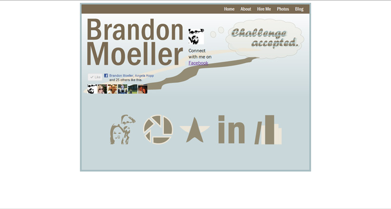
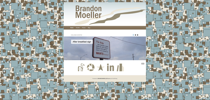
The new BrandonMoeller.com launched quietly on Sunday. It was redesigned using the same color palette and, similar to its predecessor, was created as a child theme on top of the new TwentyEleven parent theme that ships as the default theme with the latest and greatest version of WordPress. I previously wrote about how much I liked the new TwentyEleven theme.
The static pages of the previous version are archived here:
https://brandonmoeller.com/old_design1107

WHY I DID IT
Here’s an example of what my new responsive Hire Me page looks like when you adjust your web browser to a skinny sliver (or view it on a smart phone).

What really made me take the plunge and do the redesign was the responsiveness built into the new TwentyEleven theme, and the web standards community’s recent embrace of a responsive design philosophy, probably best articulated by Ethan Marcotte in his book, Responsive Web Design. His book was the first e-book I have ever purchased (it was cheaper than a physical copy!) and by the looks of the way things are going these days – it won’t be the last.
I’ll put the “responsive” philosophy in my own words here. Websites should look great on all devices, and by great, I mean you should be able to easily read the copy and see the crucial images and most importantly, use the website as it is intended to be used.
I think the new default TwentyEleven theme does just that, and I’m happy to develop my own style on top of it with a child theme I’m calling ….
Bmo Two 1.0.0 Child Theme for TwentyEleven Theme for WordPress 3.2.1 (Download it.)
WHAT CHANGED
I’d like to say not much changed, but the new background image and the desire to switch the body content of the page to white from the previous blue make the redesign look more involved than it really is.

I ditched the “about” page, because, you know. Who cares? (It was also getting depressing changing the age that I am every year on that page).
Besides, I’m not really who I say I am, am I? I’m who you think I am. And to that end, I want you to see a lot of pretty photos, and a lot of hard work and that way, you may draw the conclusion that I am blank or perhaps blank, or maybe even blank. But! I’ll let you figure it out … instead of me telling you.
Oh no, I’ve told too much. . .
So, with the redesign, I now have four items in my main navigation menu. “Home,” “Hire Me,” “Photos” and “Blog.”
For easier navigation, and to drive more traffic to them, I made the subpages of the “Hire Me” appear in the menu when one passes their mouse over it. This freed me from having to create a new navigation box on the subpages.
And now, all pages on the website are built into the WordPress system, the more elaborate of which like the main “Hire Me” page, were created by using WordPress page templates that I hand-coded.
I also removed most, if not all, of the Facebook integration. I might bring this back. Or, I might just integrate Google+ instead.
One thought on “The August redesign”