Prior to today, the website for the University of Houston’s C. T. Bauer College of Business looked like this:
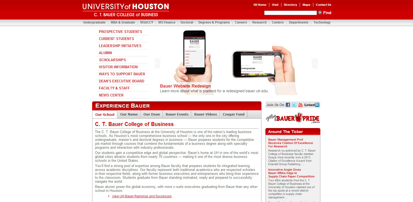
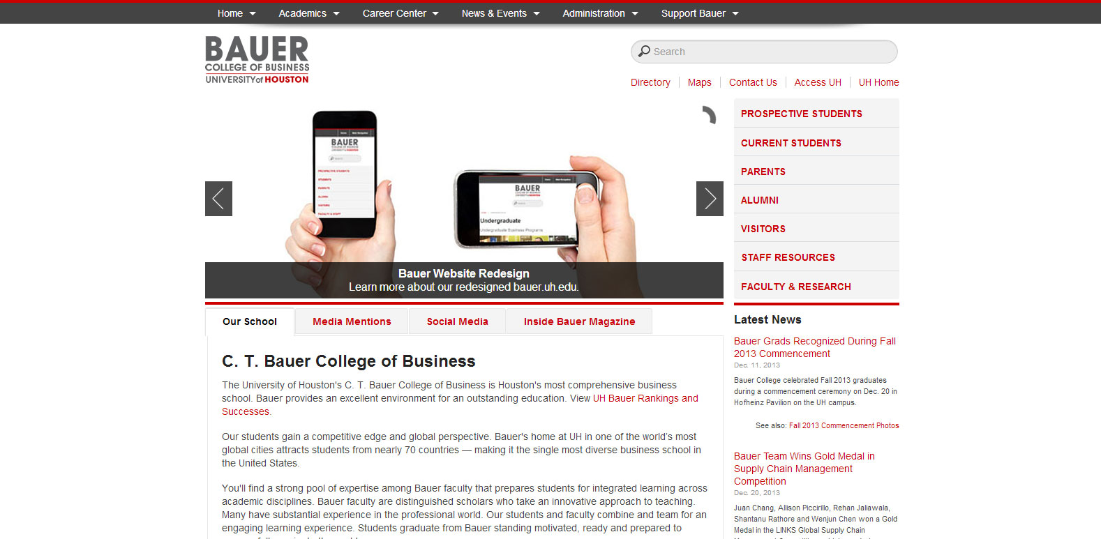
Today, we launched the new website for the college. It now looks like this:
An origin story
My involvement with the bauer.uh.edu website redesign project began before I was hired as the new web developer at the college back in late March. It started with an assignment that was part of the hiring process.
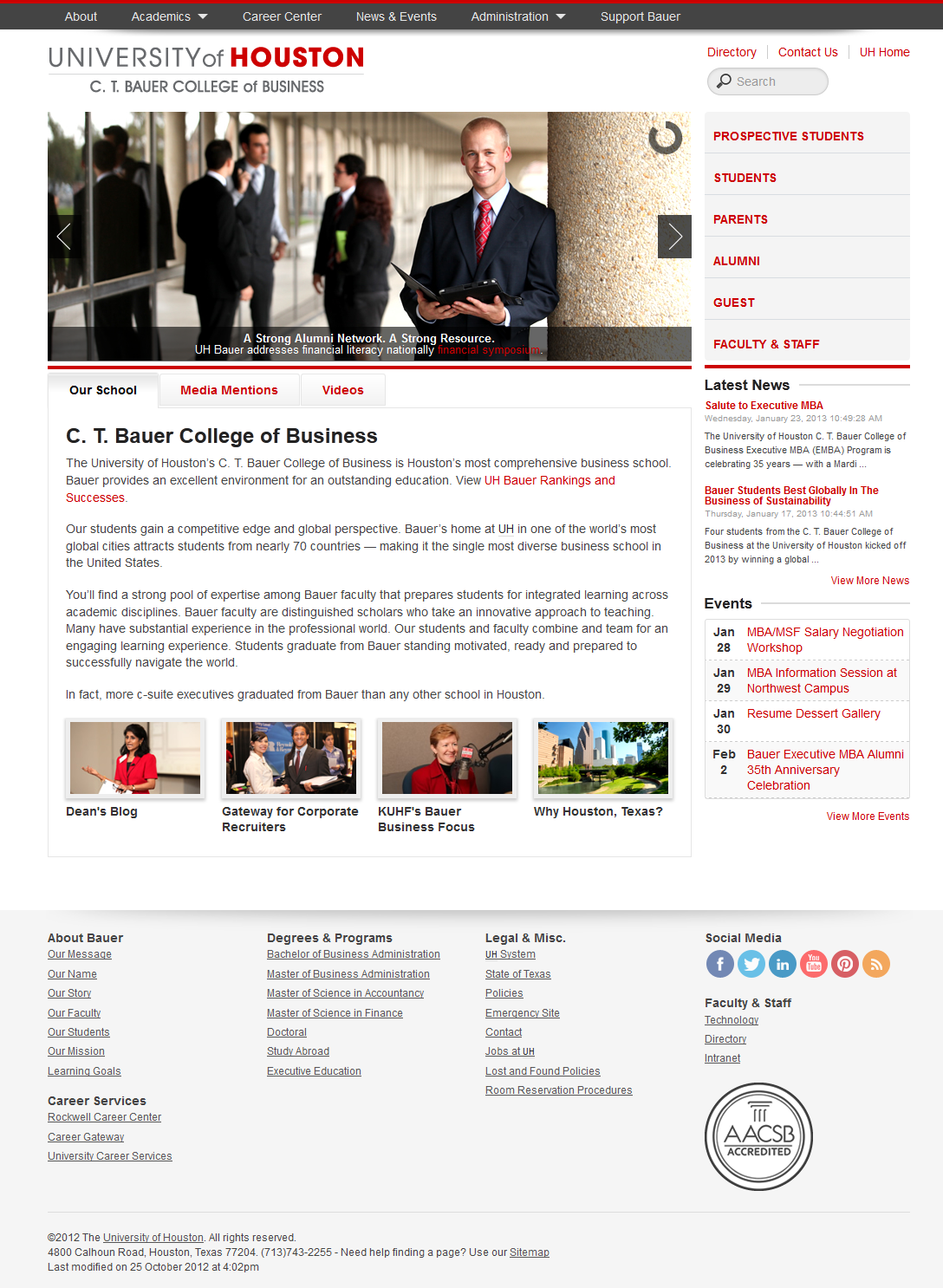
The assignment was to design a subsite of the bauer.uh.edu website (specifically, the UH Global Energy Management Institute site) using a screenshot of the new design for the homepage.
Here is that screenshot that was provided by the Bauer Office of Communications:
So I did, using the responsive Bootstrap framework. Here is a screenshot of how I approached the assignment:
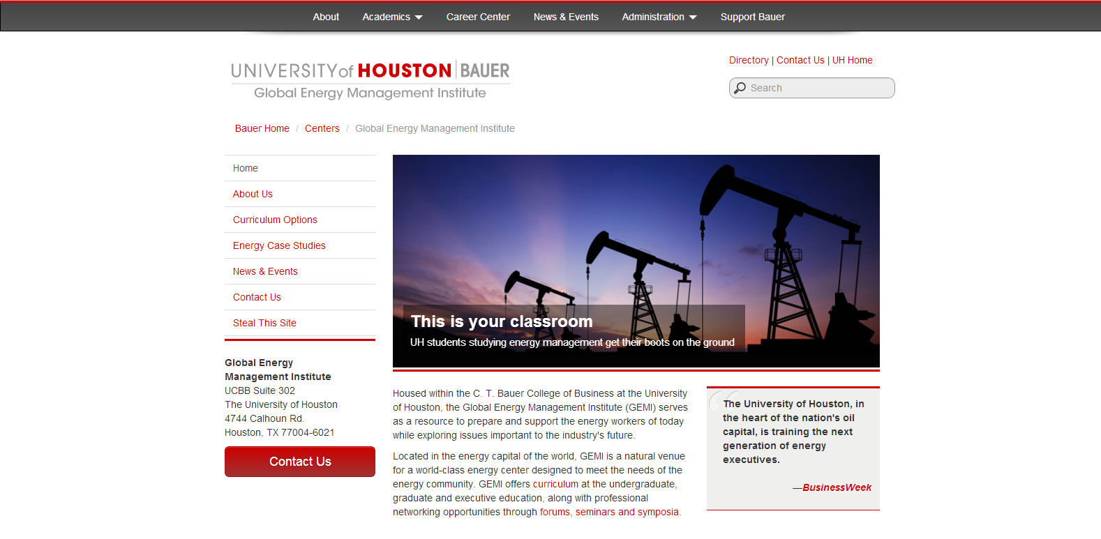
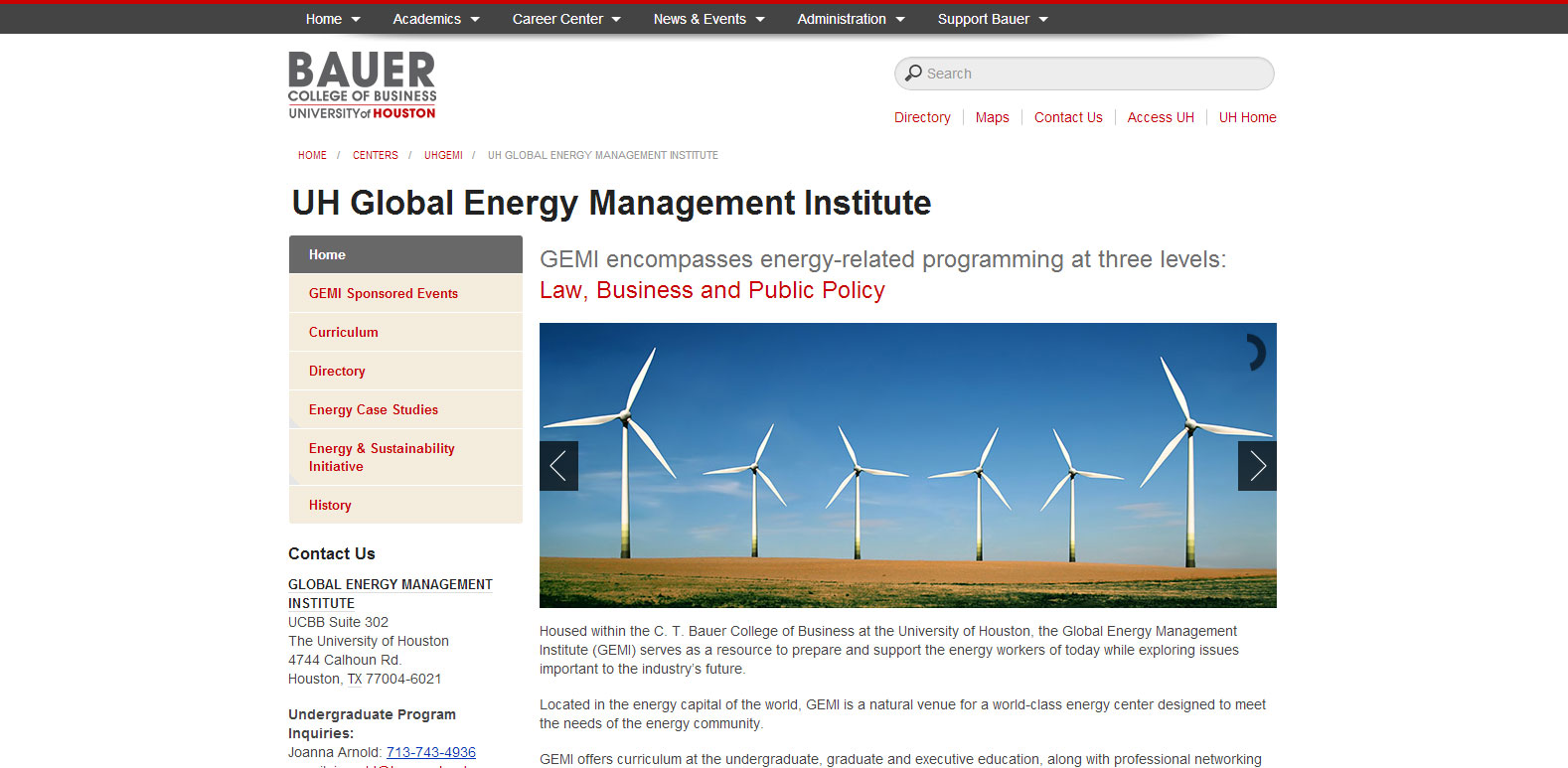
And here is a screenshot of the UH GEMI site that launched today as part of the new bauer.uh.edu website redesign:
During the interview I learned that the new website was actually being built using Zurb’s Foundation, another responsive framework similar to Bootstrap.
A collegewide effort
In April, after a week of getting acclimated to the new job, I began working in earnest with director of communications Jessica Navarro, lead college web developer Marla Molony and communications coordinator Amanda Sebesta to migrate all of the existing content that needed to be migrated into the new responsive redesign template. We wanted to be finished by the end of May so we could spend at least two months in the summer testing the new website with usability tests, focus groups and online surveys for the various audiences. To support this effort, which included an email campaign, I was tasked with creating the Redesign subsite.
It should also be noted here that former Bauer web developer Jesse Perez was instrumental in starting the redesign project back in October 2012. Most of the PHP-based template incorporating Foundation and jQuery was success that we inherited from him.
It was a tough deadline to meet the end-of-May deadline after two full months of migration, as the college website consists of more than 50 subsites and about 800 main pages of content — but we did it. Getting the content shoveling done with two months to spare really helped us free up time for troubleshooting and improving the site before its launch — I was even able to dedicate five whole days to looking for broken links using various tools like Dreamweaver and Google Developer Tools and fix them.
As we presented the new website to our audiences, their feedback allowed us to realize a few weaknesses that we were then able to strengthen before launch.
What I’m most proud of
Here is a top 5 list:
- Now, fully responsive, with text reading well on mobile phones and tablets.
- More consistent subsite navigation. In the previous website, links in the left main navigation of each subsite would sometimes take people to another subsite all together. With the launch of the new site, we tried our best to limit these confusing navigation patterns and in the process, simplified a very complex website.
- A better top navigation sitewide with three levels of hierarchy. What I like most about it is how the Academics section displays four distinct categories: Programs, Departments, Centers and Advising – and each of the first three categories then display their distinct subcategories in a manner that helps the new student understand the basic structure of the college.
- New print stylesheet allows for websites to look good even when printed. (Yes, we still live in a world where people print things.)
- The first-ever XML sitemap for Bauer informs Google and other search engines about our page structure.
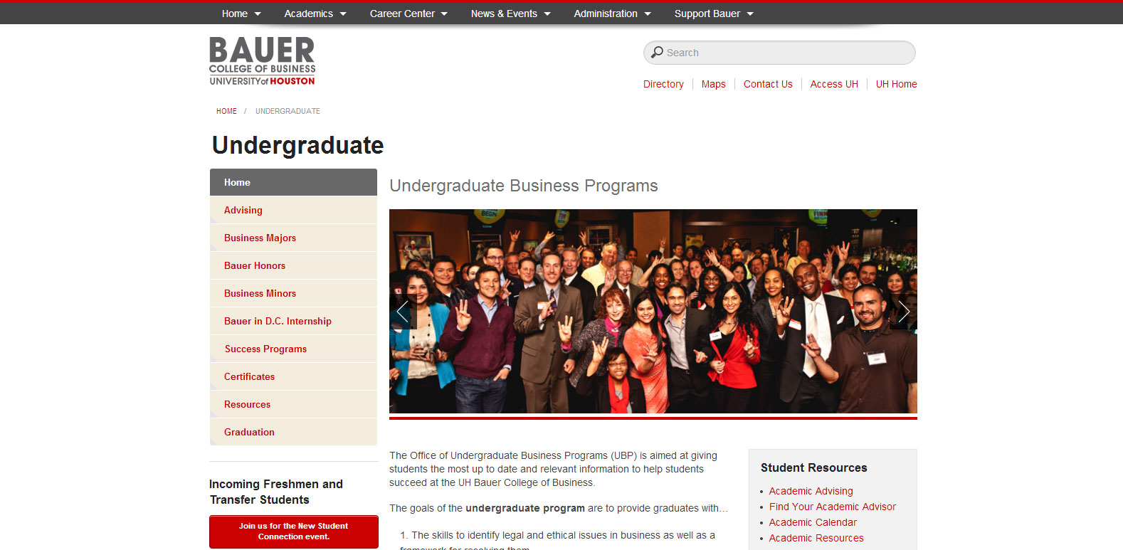
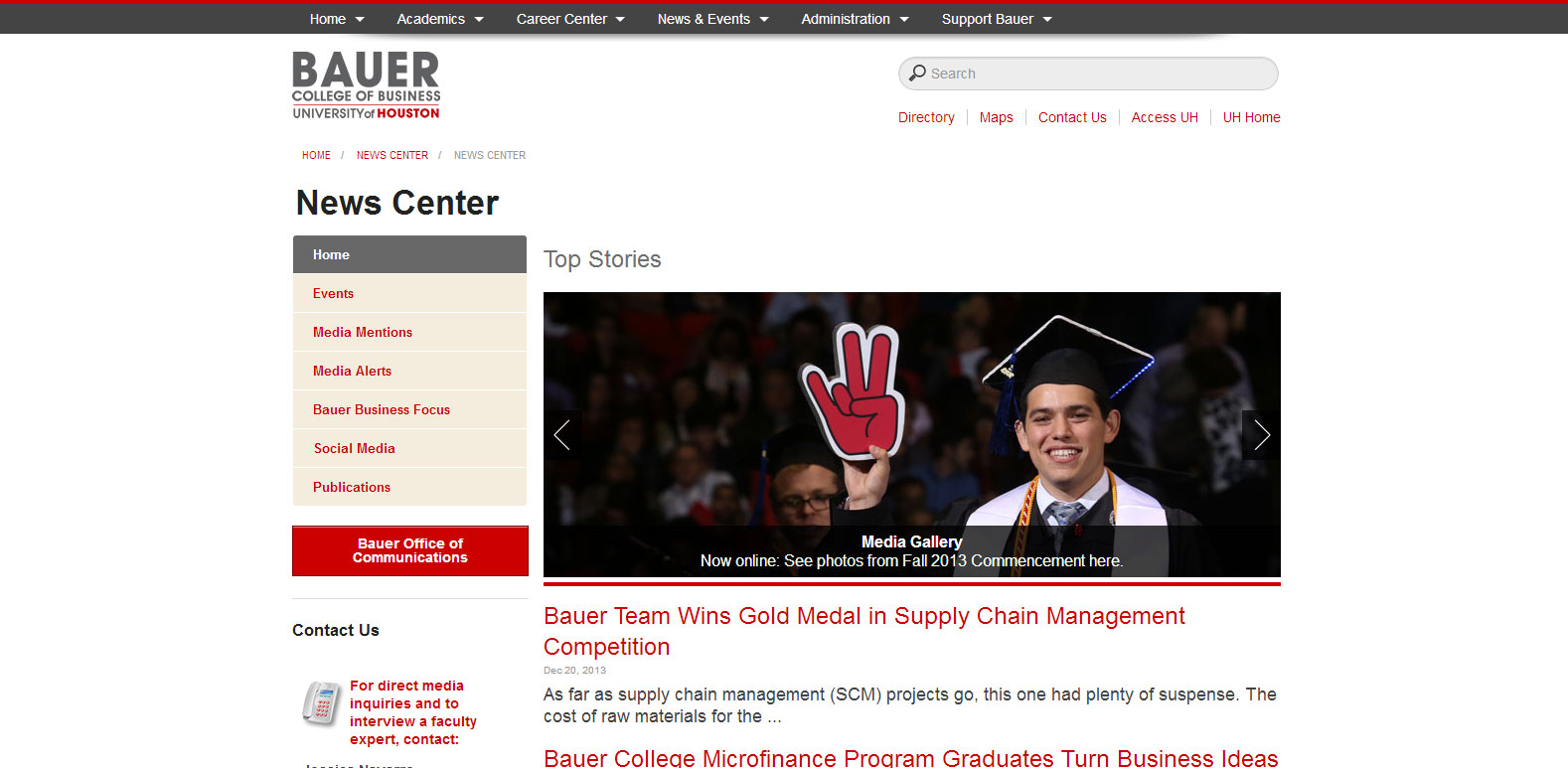
I’m proud of the following two subsites which, among others, I migrated during the redesign process.
Undergraduate
News Center
One thought on “New bauer.uh.edu website launches”