Blog
Bran Moe
I created a favicon for my newly redesigned website.
When I tried to jam my whole name into 16 pixels by 16 pixels, it didn’t look too swell. Just cramming seven letters looked better.

A favicon.ico is a small icon that browsers use to add some flair to the window tabs and bookmark links. It’s the closest I’ll ever come to corporate branding.
I also modified my functions.php file in my WordPress theme to include the code to call the .ico on every page within the blog.
Here are some helpful web pages I found that helped me accomplish these tasks.
“How to create a favicon.ico” from PhotoshopSupport.com
“Child Themes” from the WordPress Codex
The July redesign

It has been two weeks since my last redesign.
My redesign project for BrandonMoeller.com began on July 5 and ended a week later on July 11, and I’m very happy with the results.
The previous design had served me well for a number of years, from Feb. 6, 2008 to July 5, 2010.
It was time for a change.
COLORS

I started by deciding on a color palette. I chose “Good Friends” desgined by Colour Lovers user Yasmino.
FONTS
Next, I chose Franklin Gothic FS by FontSite Inc. to be my official font, so I bought the whole family from FontSpring.com, and unlimited licenses to put it on as many websites as I please. The two fonts currently used on the site are Franklin Gothic FS Medum Condensed and Franklin Gothic FS Book. I even incorporate these fonts in my blog.
A picked a (free) secondary font from FontSpring called Merge Regular from Philatype. I really like this font, but I just don’t have many places to put it at the moment. Currently, it makes the text in my sidebar on my “Hire Me” page stand apart.
A SIMPLER DESIGN
I wanted a simplistic design that would allow the content to shine. So, I spent a lot of time revising my content, consolidating pages and reducing clutter. I got it down to five pages, and developed intuitive titles for the pages: “home,” “about,” “hire me,” “photos,” and “blog.” I wanted my homepage to be free of the boring introductory text that — for whatever reason — everyone else is convinced they must have. However, I think visitors to my website are aware that they’re at my website, and I’d rather have graphics and the content to do the talking.
Being a fan of the social media, I wanted to maintain my previous website’s homepage feature that listed all of my other pages out there on the Internet. But, instead of a list, I decided to make vector-based graphics for my 10 favorite external sites. Hovering over these images reveals a splash of color and movement. Soon, I’ll probably use the jQuery javascript library to add more icons in a slider format for the other websites I didn’t have room to mention.
FACEBOOK + PICASA
Also, I wanted to tap into the Facebook API on the homepage. At launch, I added the famous “like” button to the homepage, and future plans including a Facebook comment box on every page. That’s coming soon. I want more people to hit that “like” button, first, though — before I go to the trouble. Ahem. I’m talking to you.
I also created a new section for my photos using a javascript that embeds my Picasa Web Albums right onto my website, making it appear as though the photos are housed on BrandonMoeller.com. The JavaScript I used was written by Jesse Berman and works just like he promised it would on the open source website SourceForge.
THE NEW BLOG
Last but not least – certainly not least because it probably took up most of the time I spent during the redesign — I updated my WordPress blog from version 2.6 something to the brand new WordPress 3.0 “Thelonious.” I then took the new standard WordPress theme of Twenty Ten and built on top of it, customizing it to look like the design I created for the new BrandonMoeller.com, allowing for a seamless experience for my blog visitors. When I get around to it, I’ll likely make the new BrandonMoeller.com into a template file that can be publicly downloaded for anybody who wants to mimic my design, as well as make my WordPress theme build-on available.
I’m also now tracking the traffic of my website with Google Analytics — I’m very impressed with what the tool allows me to discover about my visitors.
If you like the new website, please let me know what you like — and why — in the comments below.
New STP worth the wait
To be honest, I thought I was listening to a dud when I first popped in the new Stone Temple Pilots, their first record in nine years — and the first one I’ve picked up since 1996’s Tiny Music .. Songs From the Vatican Gift Shop.
A lot can happen in 14 years, and I’m sad to report that there is no powerhouse well-written single like “Trippin’ on a Hole in a Paper Heart” or “Vaseline” on the new record.
There’s a lot of what you’d expect, though — some crunchy, roarin’ rock songs from two brothers and a recovering rock star.
The disc opens with “Between the Lines,” with Scott Weiland belting:
“I like it when you talk about love
You always were my favorite drug.
Even when we used to take drugs.”
I bet you’ll be hearing a few of the more infectious cuts off this record on your mainstream radio, including the first single “Between the Lines.” The video of which, found on their website, features what you’d expect of the band made famous by MTV: An attractive model who keeps putting on her clothes and an aging Weiland withering and waltzing to the music.
Other radio-worthy gems: “Hickory Dichotomy,” “Cinnamon,” and “Maver,” the last of which closes out the disc and is a song that has it all — including ponies and pendejos — and the ever-important question, “How many nights did you make it without it?”
Of course, it wouldn’t be a STP record if there weren’t some pretty ridiculous songs thrown in the mix. For instance, “Dare if you Dare” must be one of the lamest songs I’ve ever heard. Ever. I won’t even dignify “Bag Man” with my criticism, let’s just pretend that track was never pressed.
All in all, I’m glad the band that got me through junior high alive and emotionally accessible is back at it again. It’s good to hear old friends again, even if on “First Kiss on Mars” someone sounds a little too much like Bowie, in a stab at a radio-friendly summer love song complete with “super magic robots” and a free “solar system.”
If the album were to hinge on one thought, it’d be a line from the second track “Take a Load Off,” an otherwise boring song: “Could our shattered past just set us free?”
Here’s hoping that Weiland stays in the studio and out of the jailhouse.
Buy the deluxe edition. The live material and the added cut “Samba Nova” is worth the extra scratch.
Like in “12 Gracious Melodies” on Purple Weiland takes the opportunity to croon on the bonus track:
“You can always buy a new lie
When yours is finally over
Either way you’ll find a new life
When yours is finally over.”
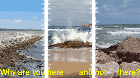
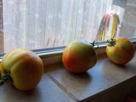
Week Eighteen
Photos from the eighteenth week in the garden are up, spanning July 12-18, and have been tagged “Week Eighteen” in my Gardening 2010, Part Three album in my Picasa Web Albums. To see the original bed photos — in a slideshow from week to week — visit my Gardening 2010 photo album on Facebook.


Stuck
In defense of Lady Gaga
The world needs Lady Gaga. That’s why she’s selling more albums than all the artists I usually listen to. And her tour? It’s the hottest ticket this summer.
OK OK OK, before we go any further, the obligatory disclaimer: She ain’t doin’ nuthin new. See Elton John, Madonna, Cher plus countless others who arguably have done it better. But, they did it then. This is now.
I mean, seriously. We have a disaster fustercluck in the Gulf. We have a liberal president who all my extremist wacko relatives hate — passionately — yet, we’re still entangled in two endless wars, the economy’s still a flatliner, and all we got is some minor gains in the student loan and debit card rackets. Social security? Still broken, we won’t see any of it. And we have a fustercluck in the gulf. And tar balls in Galveston! And we’re all oil-guzzling accessories to it, one could argue, or …
We can listen to Lady Gaga, singing:
“Sorry I can’t hear you I’m kinda busy.
…
Stop calling, stop calling, I don’t want to think anymore.
I left my head and my heart on the dance floor.”
Play that “Telephone” track, and like — heh — who cares if John Cornyn’s about to throw a hissy-fit on the senate floor over Elena Kagan, lowering himself to Orrin Hatch’s level. I mean, I’m kinda busy.
On “Dance in the Dark,” she advises:
Find your freedom in the music.
Find your Jesus. Find your Cupid.
Nevermind Rick Perry. Maybe “Monster” applies:
“He ate my heart.
He ay-eight-hate my heart
That boy is a monster.”
At least, the last poll I saw, reported Bill White’s neck and neck. Hope, you see, is on the horizon, see: “So Happy I Could Die.”
“Happy in the club with a bottle of red wine
stars in our eyes because we’re having a good time”
She could reveal more with her lyrics, and less with her costumes. Well, i guess you can’t have it all.