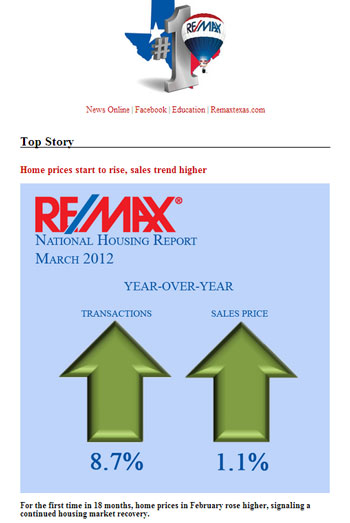
Today, I sent the RE/MAX of Texas eNewsletter to the statewide real estate network using a new responsive template that I customized.
The eNewsletter now looks great on any device it is viewed on, in any email client, thanks to an open source template created by Sean Powell, The Engage Group that I found and customized for RE/MAX of Texas.
The template was designed to incorporate many of the design elements that were used in the previous RE/MAX of Texas email newsletter template.
This new approach to email design for RE/MAX of Texas came two weeks after RE/MAX, LLC unveiled the new RE/MAX Mobile App suite for iPhone and Android at the RE/MAX R4 Convention in Las Vegas, as discussed in the previous newsletter issue.
Here are links to other individual eNewsletter issues that I am proud of:
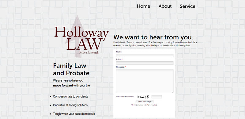
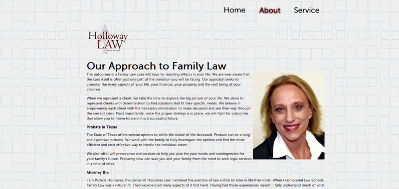
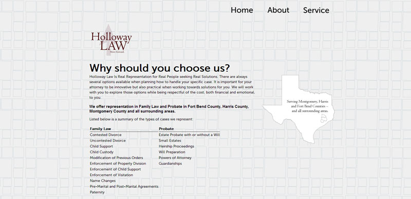
Today, I launched the new website for Holloway Law, owned by Patricia Holloway, a local firm serving the tri-county area of Montgomery, Harris and Fort Bend.
It’s simple three-page presentation — with a contact form front and center on the homepage — makes for a clear website that gets its point across quickly.
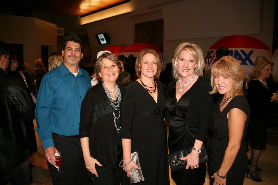
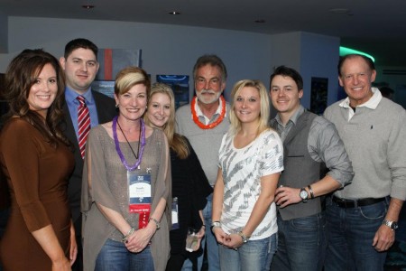
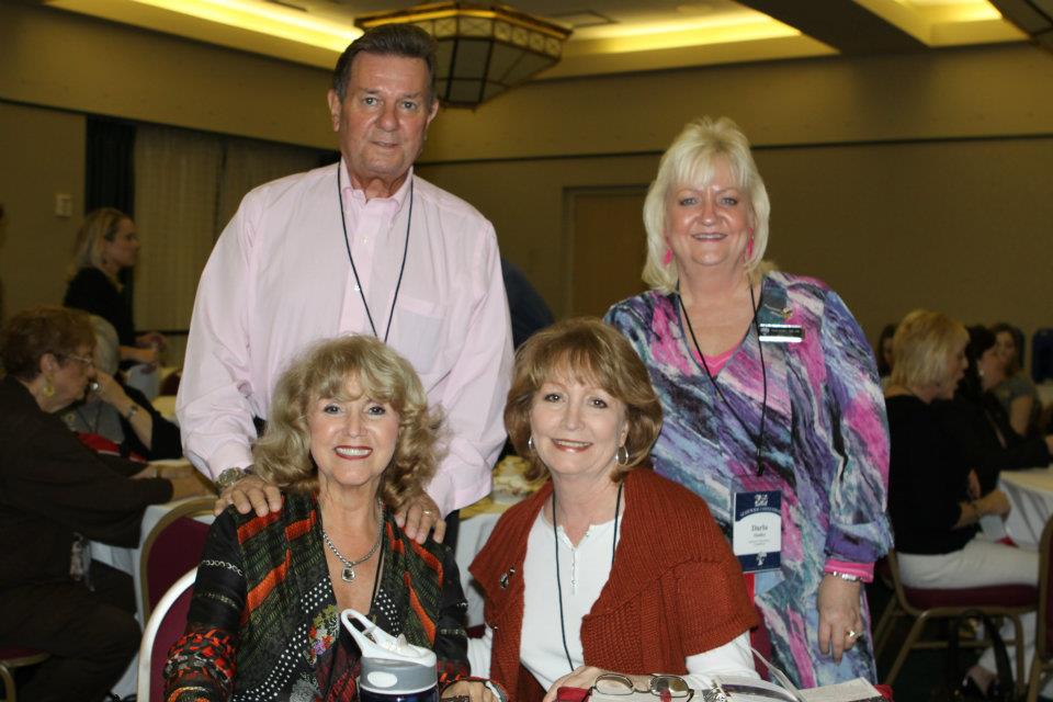
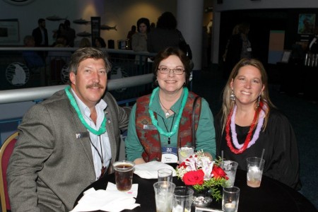
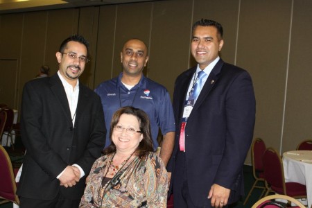
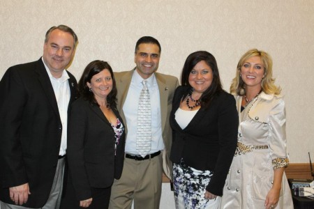
I was one of four official event photographers for the 35th Annual RE/MAX of Texas Statewide Convention Jan. 27-28 at Moody Gardens Resort and Conference Center.
For most of the two-day convention, I wandered the hotel taking photos of some of the best Realtors in the state as they attended breakout sessions, received awards and networked, networked and networked.
The photos shown on this page were from the Friday evening “Fun Night” at the Moody Gardens Aquarium.
[clear]
See a list of all photos that were taken during the event and links to all of the stories, on a page that I created and maintained:
Readers who use Google Reader to read WordPress powered website RSS feeds on their small-screen mobile devices don’t get the full picture if the WordPress site in question uses the caption short code functionality, because the resulting inline CSS code that displays does not instruct the feed reader to scale the image down to fit the screen.
See, i.e.:
In this image, a giant photo in a post is poorly displayed in Google Reader as a result of the default settings of WordPress 3.3 (and previous versions that include the Caption feature). As displayed on my Android-powered Nexus S from Google, running the latest version of Google Reader, Version 1.1.1.
The solution:
I created a new WordPress plugin called RSS Responsive Caption to adjust the inline CSS styles that get attached to images with captions to make them more “responsive.”
Really, all that was needed was the following CSS code to specify that the maximum width of an image should be 100% (of the screen size). That’s responsive web design, in a nutshell.
max-width: 100% !important;
height: auto;
Creating a plugin to accomplish this was not necessary. In fact, anyone can do this without downloading the plugin, simply (heh) by altering lines 745-746 in the wp-includes/media.php file, from:
But! If I did it that way, then every time WordPress would release a new version of its frickin-awesome open source software package, I would have to manually go into the media.php file and change that line of code to keep my RSS feeds displaying properly in Google Reader.
Instead, I prefer the instant update method of installing the latest version of WordPress. I click the button, it does its thing and in a few moments of anticipatory suspense, I have the latest version of WordPress in all its glory, and I can troubleshoot it because my own specific modifications are separate.
That’s also why I typically choose to create child themes on top of existing themes – if the theme is ever updated by the theme author, I won’t have to manually sort out what was changed vs. how I reconfigured it, unless the theme author specifically chose to alter something I wanted to alter.
The plugin makes the viewing experience in Google Reader much better.
See, i.e.:
The photo as displayed in the RSS feed when the plugin is activated.
This plugin would not have been possible if the WordPress core team didn’t create a way to “allow a plugin to replace the content that would otherwise be returned” via the caption shortcode function (see: wp-includes/media.php, line 711), or, if they didn’t further explain the add_filter function in the codex, even going so far as suggesting the following plugin:
Basically, I took the plugin above and altered it to fit my needs, after an exhaustive search to determine that someone else hadn’t already done what I wanted to do.
I got the idea for this plugin by looking at the HTML source code of the posts WordPress generates for images with captions and images without, then Googling until I discovered what made what worked.
Articles and forum posts that I came across in the exploratory process include, but are likely not limited to:
About RSS Responsive Caption from the documentation section of the plugin:
This plugin allows publishers to better control the width of photos that use the WordPress caption shortcode feature, when that content is displayed in RSS feed readers like Google Reader, as displayed on small-screen mobile devices.
This plugin accomplishes the same thing that adjusting the “function img_caption_shortcode” code in includes/media.php would, but allows the user to automatically update WordPress without worrying about losing these changes.
It is the author’s hope that in future releases of WordPress (post 3.3), this plugin will prove unnecessary if (hard-working, responsive-minded) WordPress core developers decide to include the fix in newer versions of the awesome great open source software we have all come to love.
Today, I designed an e-mail to be sent to top-producing Realtors in Galveston, announcing that RE/MAX of Texas is coming to their town for its 35th Annual Statewide Convention – and that they were invited, too.
The HTML e-mail contains writing by Mike Sumerlin, with a banner and a register button designed by Brian Miller and Mark Bohenick.
I began developing the WordPress-powered website less than two months ago when hired as the new (and first-ever!) Online Communications Specialist for RE/MAX of Texas, the independently owned and operated small business which owns the franchise rights for RE/MAX in Texas.
The website serves as a central location for the Marketing Department to report stories and press releases about offices and agents across the state.
The site is based on a WordPress theme designed by Parallelus, a WordPress theme design company created in 2010.
Update: January 9, 2013
More than 101,331 unique pageviews, 648 posts (agent and office stories, press releases, technology reviews and tips) and 599 comments from Sept. 2011 to present. More than 100 of these posts contain my byline for original writing.
The new BrandonMoeller.com launched quietly on Sunday. It was redesigned using the same color palette and, similar to its predecessor, was created as a child theme on top of the new TwentyEleven parent theme that ships as the default theme with the latest and greatest version of WordPress. I previously wrote about how much I liked the new TwentyEleven theme.
The static pages of the previous version are archived here:
https://brandonmoeller.com/old_design1107
This is the previous design.
WHY I DID IT
Here’s an example of what my new responsive Hire Me page looks like when you adjust your web browser to a skinny sliver (or view it on a smart phone).
The responsive style of this page was achieved with media queries and alternate content and style for thinner widths.
What really made me take the plunge and do the redesign was the responsiveness built into the new TwentyEleven theme, and the web standards community’s recent embrace of a responsive design philosophy, probably best articulated by Ethan Marcotte in his book, Responsive Web Design. His book was the first e-book I have ever purchased (it was cheaper than a physical copy!) and by the looks of the way things are going these days – it won’t be the last.
I’ll put the “responsive” philosophy in my own words here. Websites should look great on all devices, and by great, I mean you should be able to easily read the copy and see the crucial images and most importantly, use the website as it is intended to be used.
I think the new default TwentyEleven theme does just that, and I’m happy to develop my own style on top of it with a child theme I’m calling ….
I’d like to say not much changed, but the new background image and the desire to switch the body content of the page to white from the previous blue make the redesign look more involved than it really is.
This is what the new homepage looks on a 27" iMac, when the browser window is expanded to fill the whole screen.
I ditched the “about” page, because, you know. Who cares? (It was also getting depressing changing the age that I am every year on that page).
Besides, I’m not really who I say I am, am I? I’m who you think I am. And to that end, I want you to see a lot of pretty photos, and a lot of hard work and that way, you may draw the conclusion that I am blank or perhaps blank, or maybe even blank. But! I’ll let you figure it out … instead of me telling you.
Oh no, I’ve told too much. . .
So, with the redesign, I now have four items in my main navigation menu. “Home,” “Hire Me,” “Photos” and “Blog.”
For easier navigation, and to drive more traffic to them, I made the subpages of the “Hire Me” appear in the menu when one passes their mouse over it. This freed me from having to create a new navigation box on the subpages.
And now, all pages on the website are built into the WordPress system, the more elaborate of which like the main “Hire Me” page, were created by using WordPress page templates that I hand-coded.
I also removed most, if not all, of the Facebook integration. I might bring this back. Or, I might just integrate Google+ instead.
 I was one of four official event photographers for the 35th Annual RE/MAX of Texas Statewide Convention Jan. 27-28 at Moody Gardens Resort and Conference Center.