On Sunday, I retired the first banner which graced the top of every page from July 11-25 on my new website.
Here’s the retired one:
Banner 01
Here’s the current one:
The current banner
Also, I added Facebook comment boxes to all pages on the website, as well as embedding it into the WordPress template single.php, which now adds the comment box underneath every post in this blog.
I created a favicon for my newly redesigned website.
When I tried to jam my whole name into 16 pixels by 16 pixels, it didn’t look too swell. Just cramming seven letters looked better.
My new ico
A favicon.ico is a small icon that browsers use to add some flair to the window tabs and bookmark links. It’s the closest I’ll ever come to corporate branding.
I also modified my functions.php file in my WordPress theme to include the code to call the .ico on every page within the blog.
Here are some helpful web pages I found that helped me accomplish these tasks.
My redesign project for BrandonMoeller.com began on July 5 and ended a week later on July 11, and I’m very happy with the results.
The previous design had served me well for a number of years, from Feb. 6, 2008 to July 5, 2010.
It was time for a change.
COLORS
The Good Friends color palette, used on the new BrandonMoeller.com
I started by deciding on a color palette. I chose “Good Friends” desgined by Colour Lovers user Yasmino.
FONTS
Next, I chose Franklin Gothic FS by FontSite Inc. to be my official font, so I bought the whole family from FontSpring.com, and unlimited licenses to put it on as many websites as I please. The two fonts currently used on the site are Franklin Gothic FS Medum Condensed and Franklin Gothic FS Book. I even incorporate these fonts in my blog.
A picked a (free) secondary font from FontSpring called Merge Regular from Philatype. I really like this font, but I just don’t have many places to put it at the moment. Currently, it makes the text in my sidebar on my “Hire Me” page stand apart.
A SIMPLER DESIGN
I wanted a simplistic design that would allow the content to shine. So, I spent a lot of time revising my content, consolidating pages and reducing clutter. I got it down to five pages, and developed intuitive titles for the pages: “home,” “about,” “hire me,” “photos,” and “blog.” I wanted my homepage to be free of the boring introductory text that — for whatever reason — everyone else is convinced they must have. However, I think visitors to my website are aware that they’re at my website, and I’d rather have graphics and the content to do the talking.
A sample vector-based icon as it appears on the homepage.
Being a fan of the social media, I wanted to maintain my previous website’s homepage feature that listed all of my other pages out there on the Internet. But, instead of a list, I decided to make vector-based graphics for my 10 favorite external sites. Hovering over these images reveals a splash of color and movement. Soon, I’ll probably use the jQuery javascript library to add more icons in a slider format for the other websites I didn’t have room to mention.
FACEBOOK + PICASA
Also, I wanted to tap into the Facebook API on the homepage. At launch, I added the famous “like” button to the homepage, and future plans including a Facebook comment box on every page. That’s coming soon. I want more people to hit that “like” button, first, though — before I go to the trouble. Ahem. I’m talking to you.
I also created a new section for my photos using a javascript that embeds my Picasa Web Albums right onto my website, making it appear as though the photos are housed on BrandonMoeller.com. The JavaScript I used was written by Jesse Berman and works just like he promised it would on the open source website SourceForge.
THE NEW BLOG
Last but not least – certainly not least because it probably took up most of the time I spent during the redesign — I updated my WordPress blog from version 2.6 something to the brand new WordPress 3.0 “Thelonious.” I then took the new standard WordPress theme of Twenty Ten and built on top of it, customizing it to look like the design I created for the new BrandonMoeller.com, allowing for a seamless experience for my blog visitors. When I get around to it, I’ll likely make the new BrandonMoeller.com into a template file that can be publicly downloaded for anybody who wants to mimic my design, as well as make my WordPress theme build-on available.
I’m also now tracking the traffic of my website with Google Analytics — I’m very impressed with what the tool allows me to discover about my visitors.
If you like the new website, please let me know what you like — and why — in the comments below.
TypeKit is here and as more browsers start to adopt the @font-face rule, I decided to take it for the old free trial spin for BrandonandKimberly.com.
It was easy. I went to their website, signed up, chose two fonts from the free trial selection and specified what domain I will be using them on. The free trial only allows for the use of two fonts on one domain. I then copied the two-line Java call and pasted it into the head of all the site’s pages, then configured the easy-to-use TypeKit editor to specify which font corresponded to which selector in my HTML/CSS of the site, and after a few minutes, I was done.
I chose Scrivanoby Outras Fontes for my regular body text. I know, I know – it’s a little wild. And kind of a little fancy pants, but it really highlights the fact that I’m using a unique font on my Web site and if you’re cool enough to have an updated browser, then you’re cool enough to see it and, perhaps, be inspired by it and the brilliant web developer behind the Web site. All that, and Kim let me, so there.
But it doesn’t work in all the browsers I use. Here’s the results of my survey:
Go
MAC
Firefox 3.5.5
Safari*
PC
Firefox 3.5.5
Internet Explorer 8
No Go
Mac
Camino
Google Chrome
Opera
PC
Chrome 3
Internet Explorer 6+7
* Though BrandonandKimberly.com keeps crashing Safari. Doh! Man, I hate that browser.
Also, I’m kind of disappointed in the way that various browsers display the fonts I chose.
Check out these screen shots. Discuss.
Firefox 3.5.5 (PC): This is how Typekit displays our wedding Web site on the browser of my choice. Internet Explorer 8 (PC): It doesn't display as nicely, but, maybe that's just my opinion. Notice how the weights of the headlines between this one and FF are inconsistent.Firefox 3.5.5 (Mac): It looks pretty good on Firefox for Mac.
Today, I finished the designs for the coozies that we will give away during our wedding.
I designed them using Adobe Photoshop and Illustrator CS4.
Here they are:
The blue "formal" coozie.
Photos taken for the blue coozie were shot by Pin Lim, from our engagement photo shoot. The background of this coozie will be blue, so the ink needs to be white, and so the white ink is black above – which means it’s kind of hard to tell what this one will look like. I’m confident it will be awesome.
The white "fun" coozie.
One of the photos taken for the white coozie was shot by Pin Lim (see the one on the far right). The others were shot myself, holding the camera out at a decent distance. This coozie was white with blue ink, so it’s not hard to see what it will look like, since the black ink above will be blue.
UPDATE: See a photo of the finished coozie, printed by Kustom Koozies, from Pin Lim’s wedding photo shoot:
The coozies came out great. Our guests loved them!
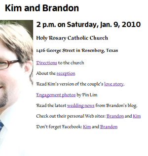
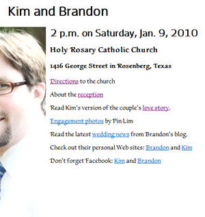
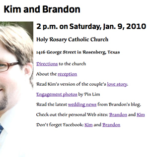
Under intense pressure from somebody who shall remain nameless, the wedding website has been kicked into orbit for your viewing pleasure, complete with photographs taken by ace photographer Pin Lim during our engagement shoot in May.
My cousin’s getting married, so that means I’ve been tapped as the photographer, and my only condition was that I can use the photos on a Web site in an effort to tap into the lucrative wedding business.